|
Joint Economic Committee Democrats
Income Charts
Chart 1.3
Last updated 9/5/06
Download this chart in PDF
-
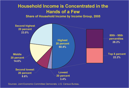
In 2005, the 20 percent of households with the highest incomes received over half of aggregate incomethe largest share on record in data going back to 1967.
-
The share of aggregate income going to the 20 percent of households with the highest incomes in 2005 was almost twice as large as that of the bottom 60 percent of households (27 percent).
-
The top 5 percent of households received 22 percent of aggregate income in 2005.
Sources: Joint Economic Committee Democrats, based on U.S. Census Bureau, Current Population Survey. 2006. Income, Poverty, and Health Insurance Coverage in the United States: 2005, Table A-3. U.S. Census Bureau, Historical Income Tables, Table H-2.
Click here for more information about the sources of income data.
|