
 |
CHARTS - THE BUSH ECONOMY
|
|||||||||||||||||||||||||||||||||||||||||||||||||||||||||||||||||||||||||||||||||||||||||||||||||
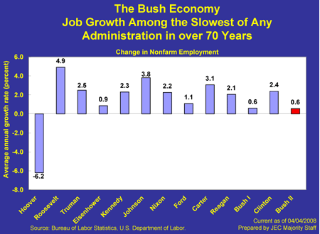
Chart 1: Job Growth Among the Slowest of Any Administration in over 70 Years |
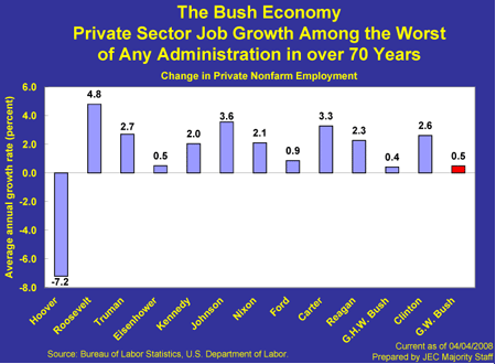
Chart 2: Private Sector Job Growth Among the Worst of Any Administration in over 70 Years |
||||||||||||||||||||||||||||||||||||||||||||||||||||||||||||||||||||||||||||||||||||||||||||||||
 |
 |
||||||||||||||||||||||||||||||||||||||||||||||||||||||||||||||||||||||||||||||||||||||||||||||||
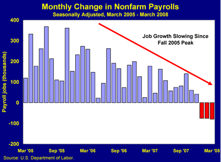
Chart 3: Monthly Change in Nonfarm Payrolls |
|||||||||||||||||||||||||||||||||||||||||||||||||||||||||||||||||||||||||||||||||||||||||||||||||
 |
|||||||||||||||||||||||||||||||||||||||||||||||||||||||||||||||||||||||||||||||||||||||||||||||||
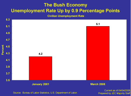
Chart 4: The Unemployment Rate is Up by 0.9 Percentage Points |
Chart 5: More Than 1.8 Million More Unemployed |
||||||||||||||||||||||||||||||||||||||||||||||||||||||||||||||||||||||||||||||||||||||||||||||||
 |
 |
||||||||||||||||||||||||||||||||||||||||||||||||||||||||||||||||||||||||||||||||||||||||||||||||
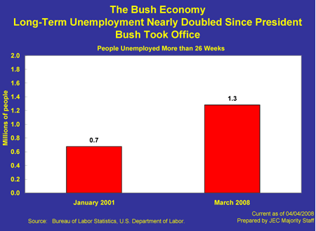
Chart 6: Long-Term Unemployment Doubled Since President Bush Took Office |
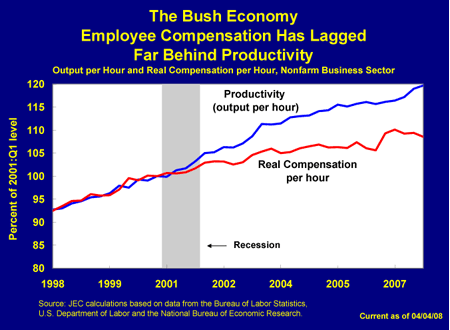
Chart 7: Employee Compensation has Lagged Far Behind Productivity |
||||||||||||||||||||||||||||||||||||||||||||||||||||||||||||||||||||||||||||||||||||||||||||||||
 |
 |
||||||||||||||||||||||||||||||||||||||||||||||||||||||||||||||||||||||||||||||||||||||||||||||||
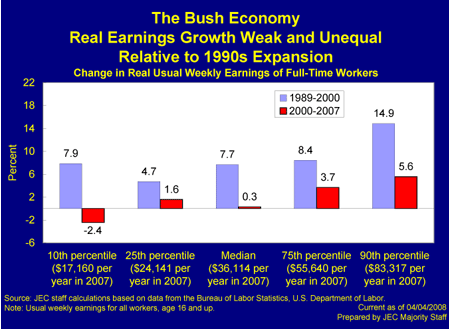
Chart 8: Real Earnings Growth is Weak and Unequal Relative to Late 1990s |
|||||||||||||||||||||||||||||||||||||||||||||||||||||||||||||||||||||||||||||||||||||||||||||||||
 |
|||||||||||||||||||||||||||||||||||||||||||||||||||||||||||||||||||||||||||||||||||||||||||||||||
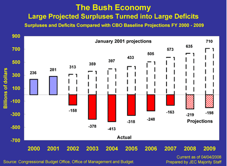
Chart 9: Large Projected Surpluses Turned into Large Deficits |
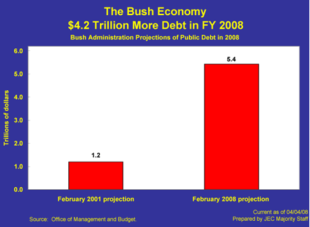
Chart 10: $4.2 Trillion More Debt in FY 2008 |
||||||||||||||||||||||||||||||||||||||||||||||||||||||||||||||||||||||||||||||||||||||||||||||||
 |
 |
||||||||||||||||||||||||||||||||||||||||||||||||||||||||||||||||||||||||||||||||||||||||||||||||
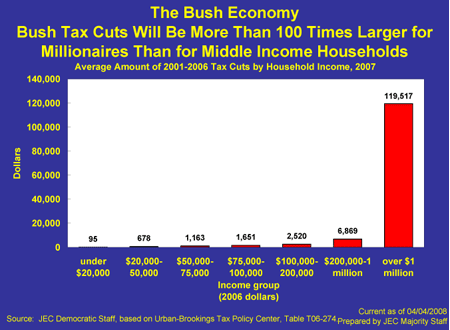
Chart 11: Bush Tax Cuts Will Be More than 100 Times Larger for Millionaires Than for Middle Income Households |
|||||||||||||||||||||||||||||||||||||||||||||||||||||||||||||||||||||||||||||||||||||||||||||||||
 |
|||||||||||||||||||||||||||||||||||||||||||||||||||||||||||||||||||||||||||||||||||||||||||||||||
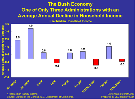
Chart 12: One of Only Three Administrations with an Average Annual Decline in Household Income |
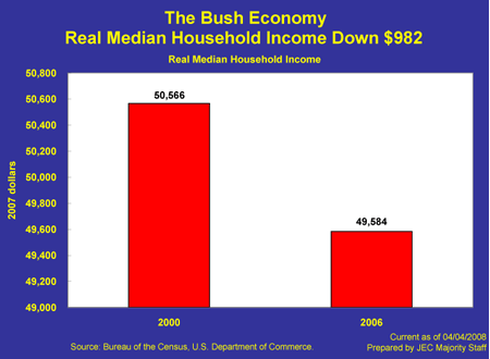
Chart 13: Real Median Household Income is Down $982 |
||||||||||||||||||||||||||||||||||||||||||||||||||||||||||||||||||||||||||||||||||||||||||||||||
 |
 |
||||||||||||||||||||||||||||||||||||||||||||||||||||||||||||||||||||||||||||||||||||||||||||||||
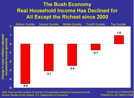
Chart 14: Real Household Income Has Declined for All Except the Richest Since 2000 |
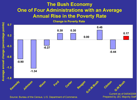
Chart 15: One of Four Administrations with an Average Annual Rise in the Poverty Rate |
||||||||||||||||||||||||||||||||||||||||||||||||||||||||||||||||||||||||||||||||||||||||||||||||
 |
 |
||||||||||||||||||||||||||||||||||||||||||||||||||||||||||||||||||||||||||||||||||||||||||||||||
Chart 16: 4.9 Million More Americans in Poverty |
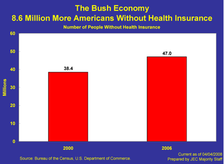
Chart 17: 8.6 Million More Americans Without Health Insurance |
||||||||||||||||||||||||||||||||||||||||||||||||||||||||||||||||||||||||||||||||||||||||||||||||
 |
 |
||||||||||||||||||||||||||||||||||||||||||||||||||||||||||||||||||||||||||||||||||||||||||||||||